Description
Technology:
- React 18.2.0 (via CDN, no build step required)
- Bootstrap 5.3.3 (grid system + responsive utilities)
- Bootstrap Icons 1.11.3
- Babel Standalone (compiles JSX directly in the browser)
- Google Fonts (theme-specific: Inter, Space Grotesk, Playfair Display, Outfit)
File Structure:
- Each theme ships as 2 files: index.html (CDN links + root div) and app.jsx (all React code)
- Separate file structure works seamlessly with local servers like XAMPP/Apache, no CORS issues
- No npm/webpack/build tools needed — runs directly in any modern browser
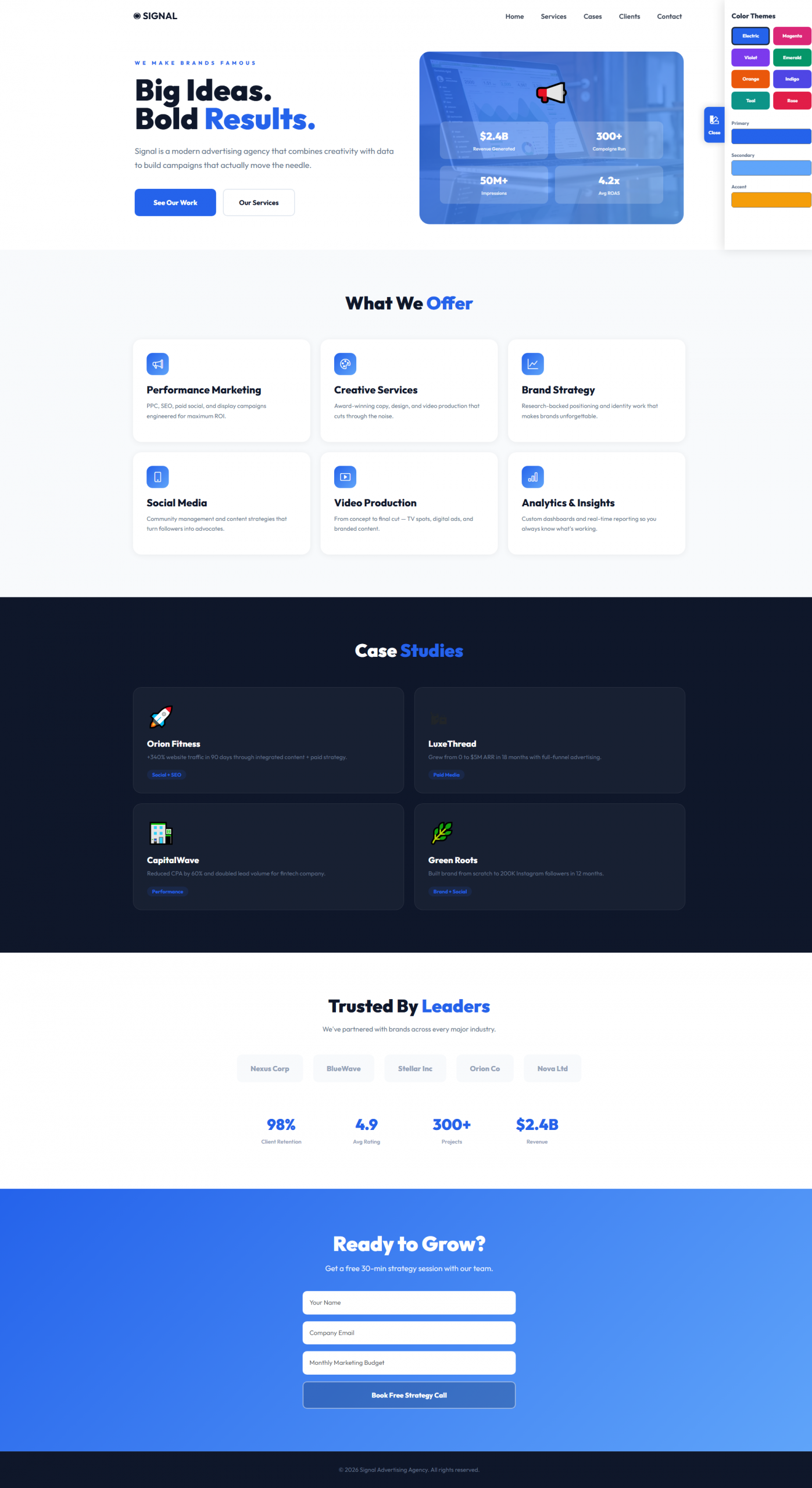
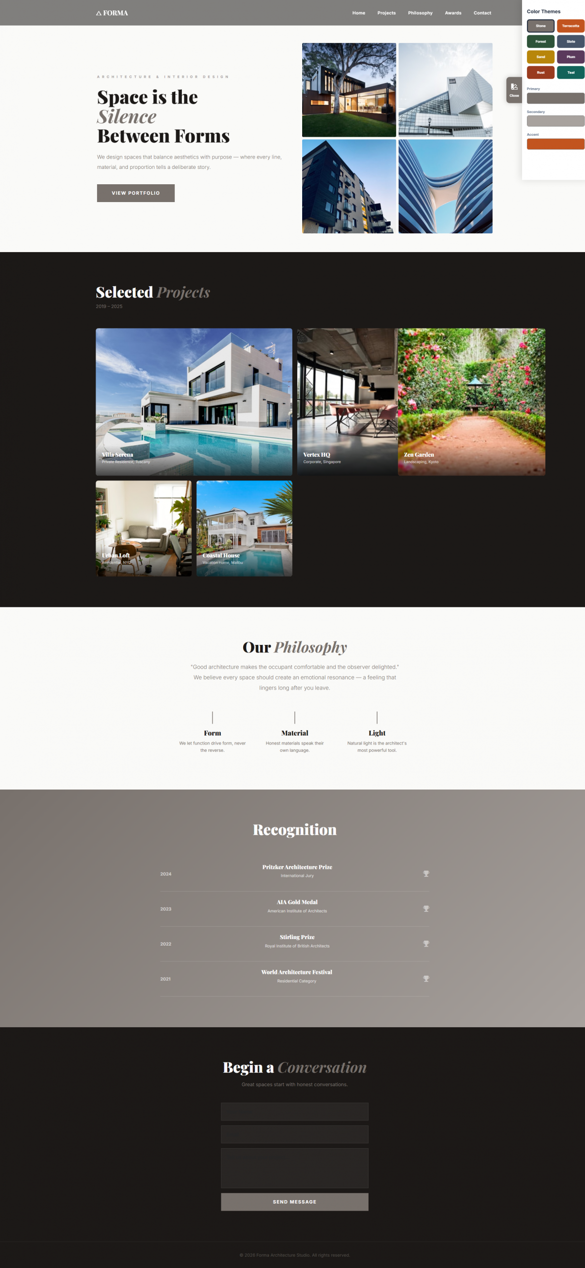
Shared Components:
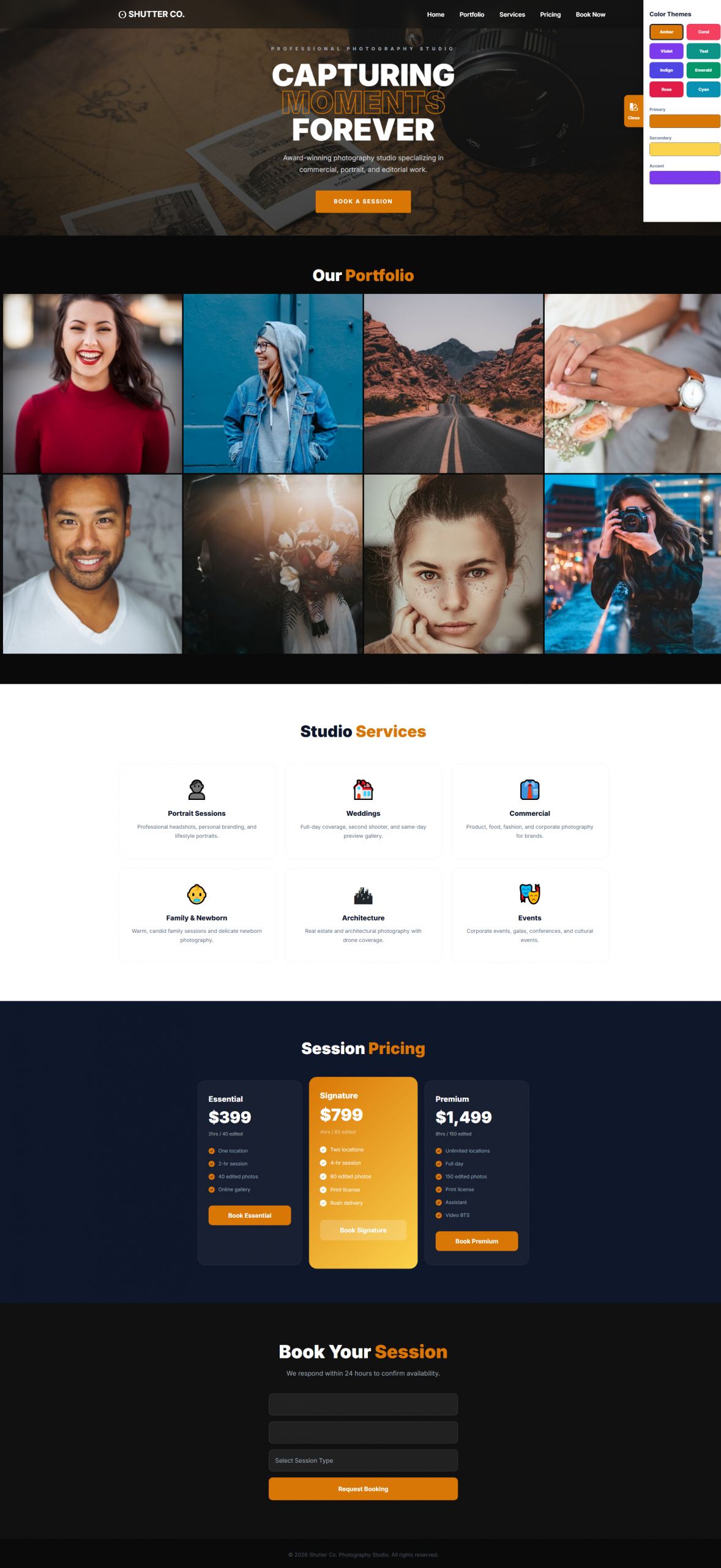
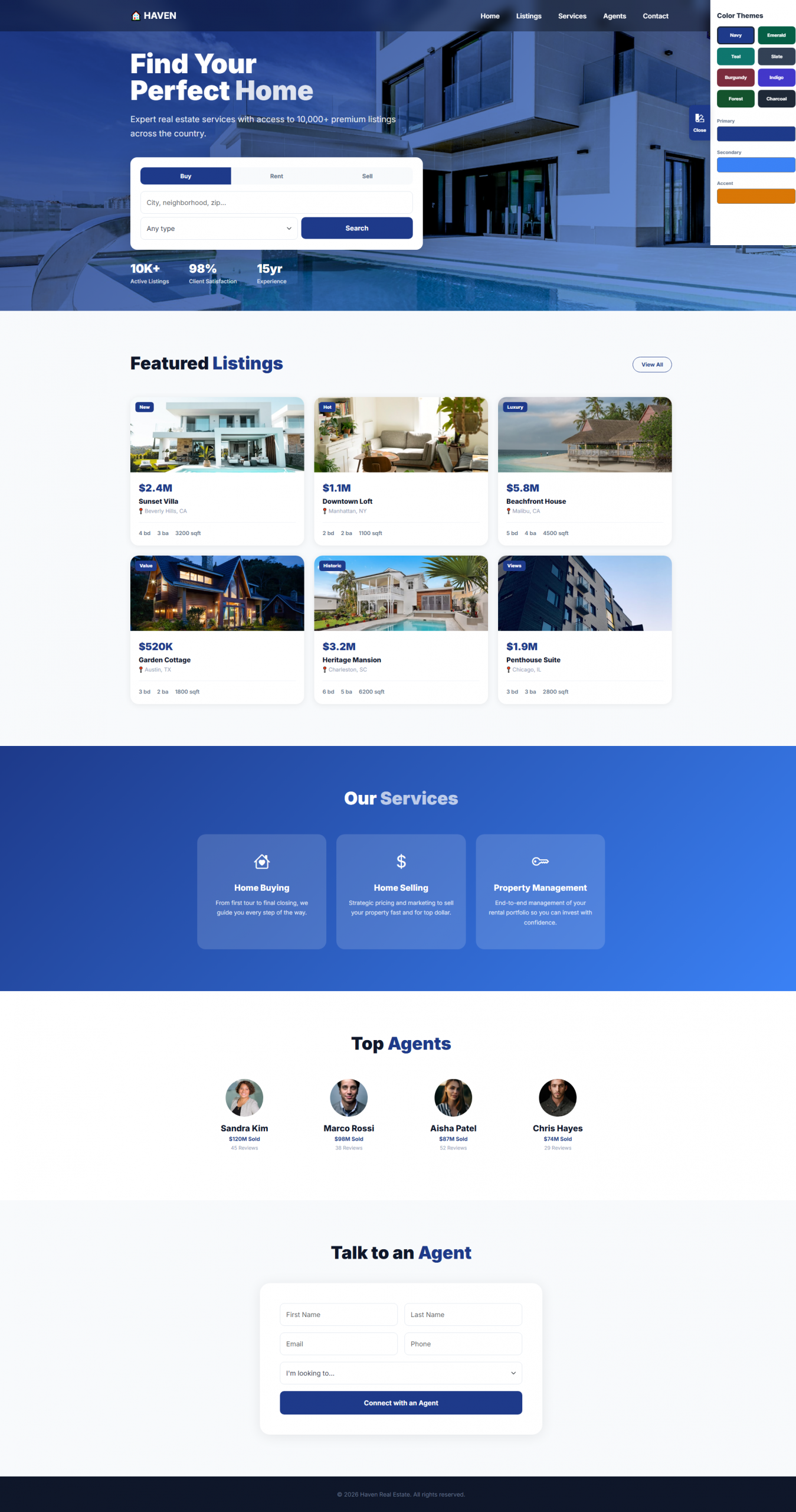
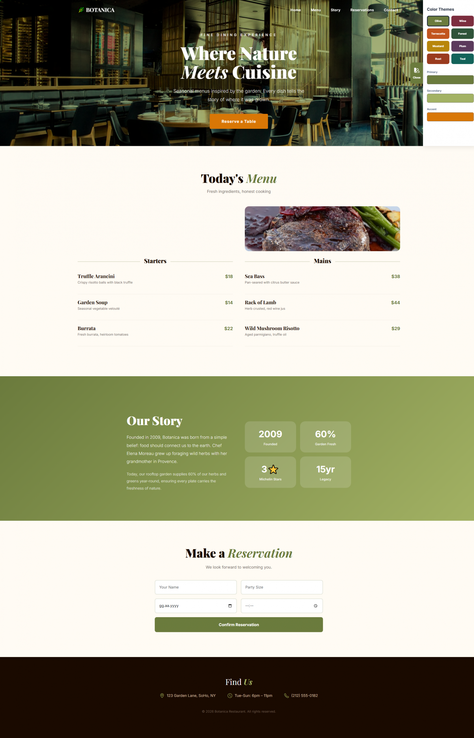
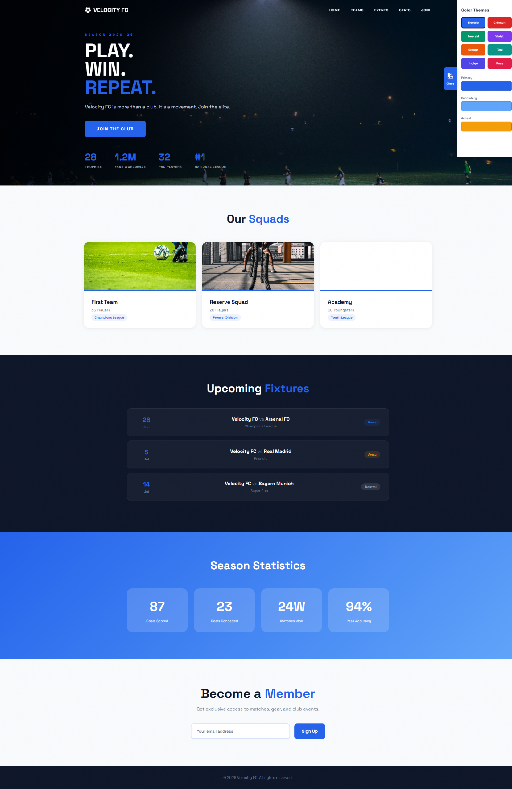
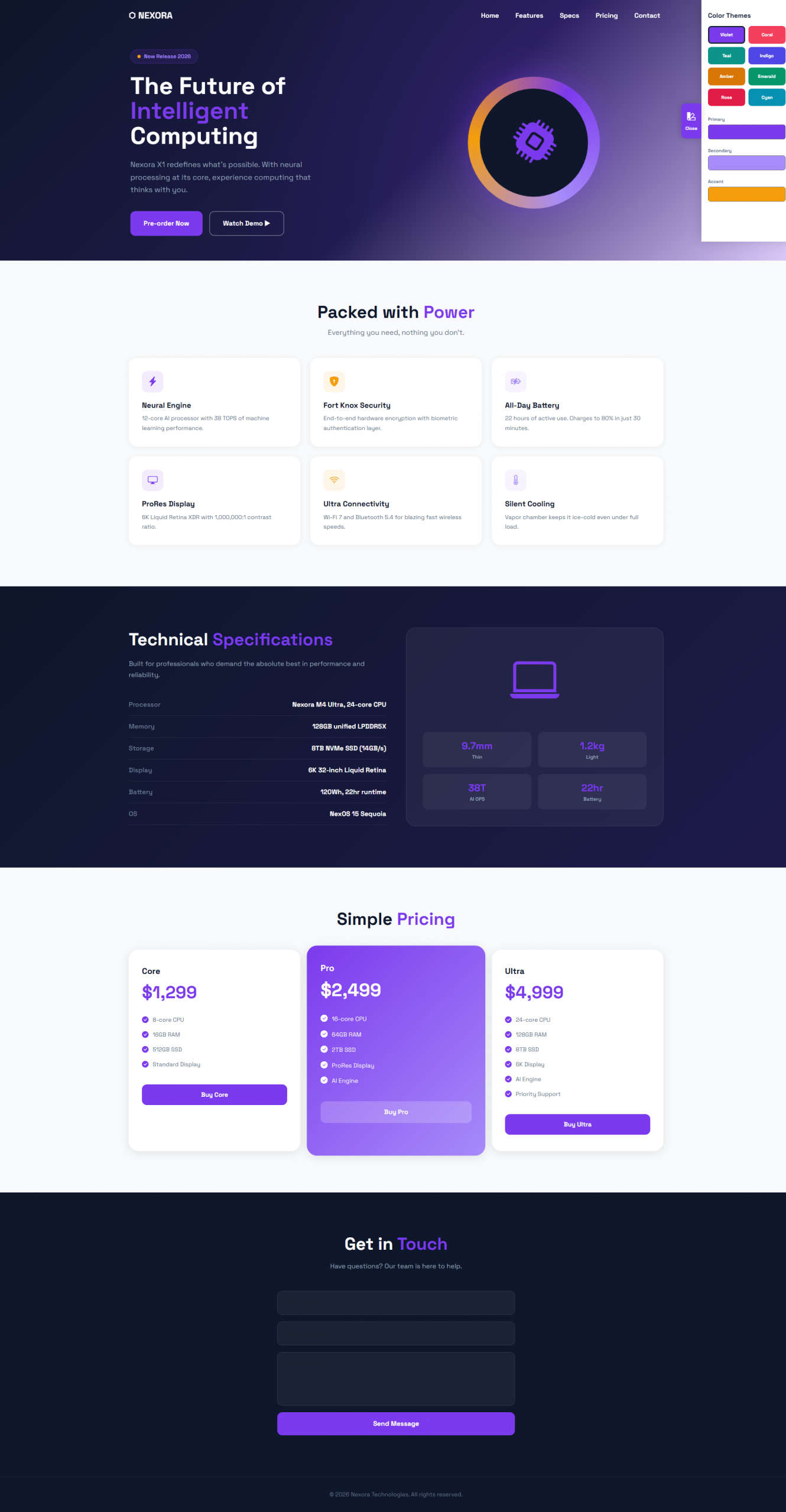
- ColorPanel — collapsible color panel on the right side (8 preset palettes + custom color picker for primary/secondary/accent)
- Navbar — scroll-aware (transparent/semi-transparent at top, solid with blur on scroll), fully responsive with mobile hamburger menu (Bootstrap collapse)
- Minimum 5 navigation links per theme, anchor-based (#section) smooth-scroll navigation
Responsiveness
All 15 themes are fully responsive out of the box, built on Bootstrap 5.3.3’s mobile-first grid system:
- Breakpoints: Follows Bootstrap’s standard responsive breakpoints (sm, md, lg, xl) — layouts automatically adapt across mobile, tablet, and desktop screens
- Fluid grid: All multi-column sections (services, team, pricing, listings, etc.) use Bootstrap’s row/col-* classes, collapsing from 3–4 columns on desktop down to 1–2 columns on smaller screens
- Responsive navbar: Collapses into a mobile hamburger menu below the lg breakpoint (Bootstrap’s built-in navbar-toggler + collapse)
- Fluid typography: Headings use CSS clamp() so font sizes scale smoothly between mobile and desktop instead of jumping at fixed breakpoints
- Flexible images/sections: Hero backgrounds, photo grids, and cards resize and reflow based on viewport width (aspect-ratio, flex-wrap, percentage-based widths)
- Touch-friendly: Buttons, form inputs, and interactive elements are sized appropriately for touch input on mobile devices
Tested visually across common breakpoints (mobile ~375px, tablet ~768px, desktop ~1440px+). No separate mobile version needed — one codebase serves all device sizes.
Browser & Hosting Compatibility
- Works on any standard web host or local server (Apache/XAMPP, Nginx, shared hosting)
- Compatible with all modern browsers (Chrome, Firefox, Edge, Safari)
- Requires an active internet connection on first load (CDN-delivered libraries and fonts)
No Setup Fee
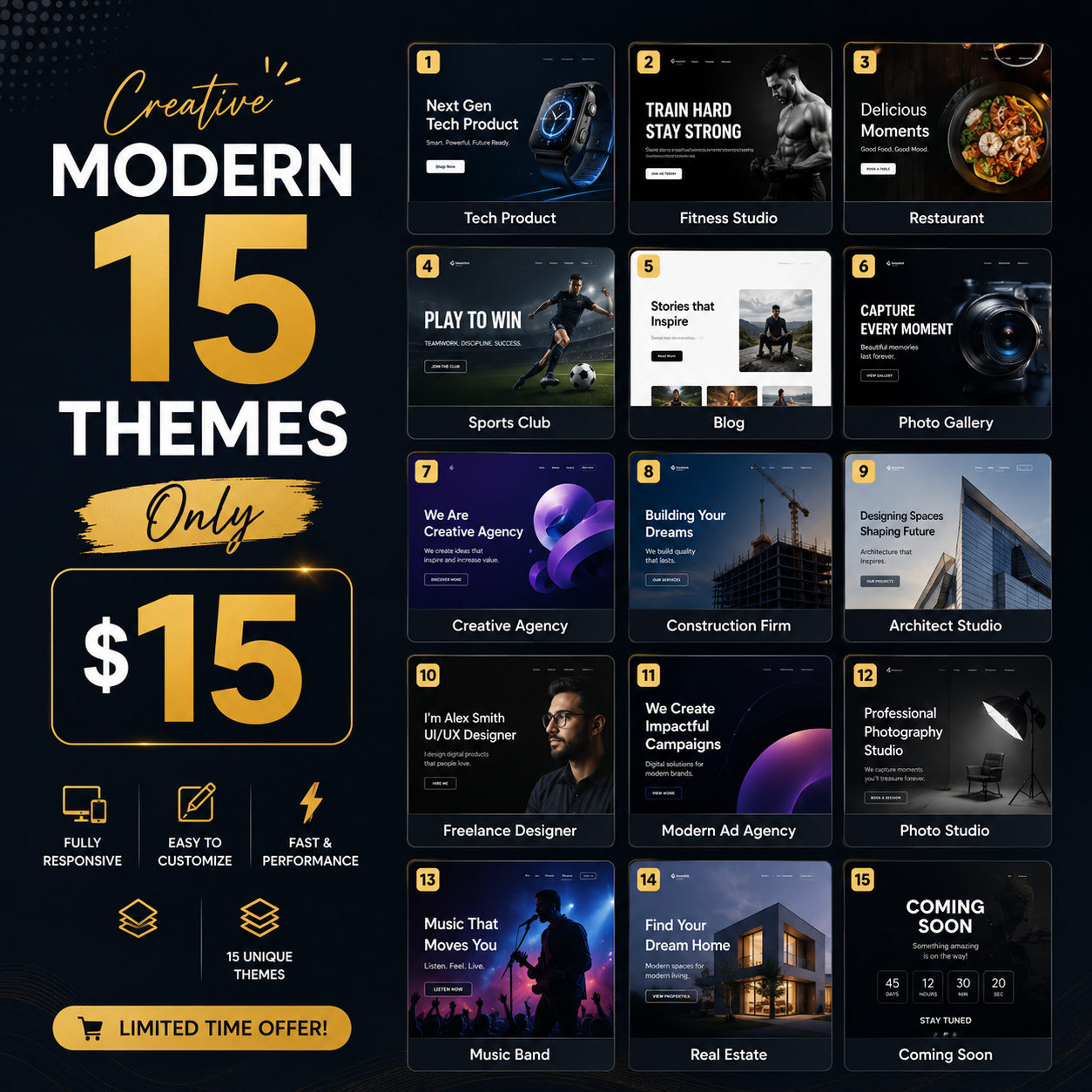
Per-Theme Breakdown
| # | Theme |
|---|---|
| 1 | Tech Product |
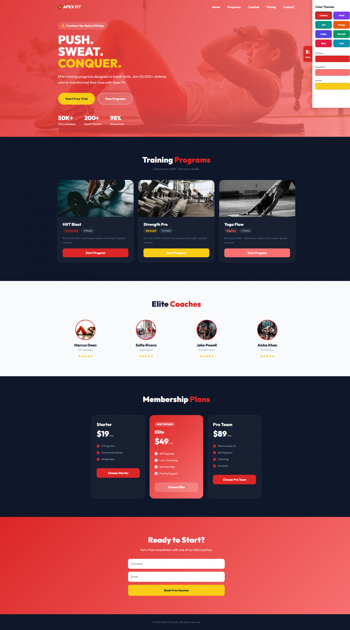
| 2 | Fitness Studio |
| 3 | Restaurant |
| 4 | Sports Club |
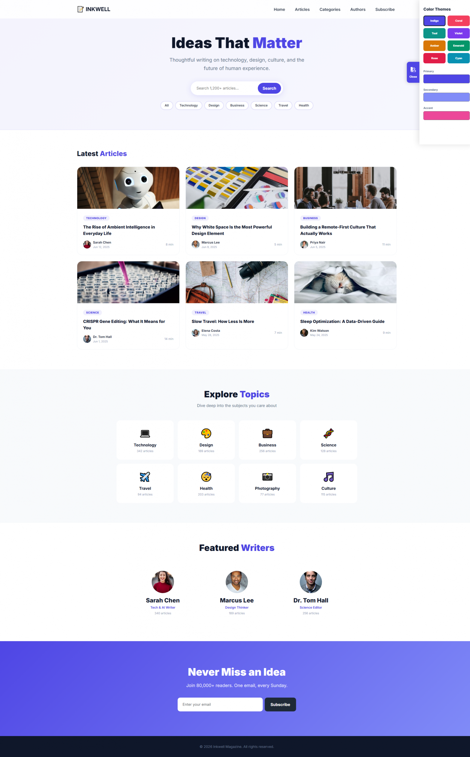
| 5 | Blog |
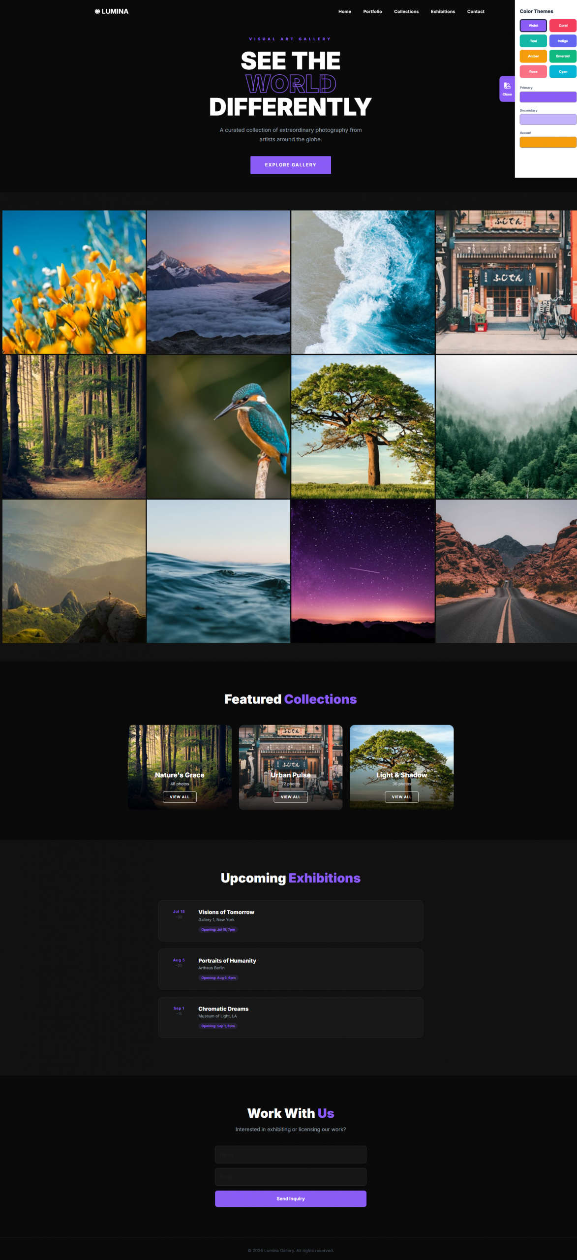
| 6 | Photo Gallery |
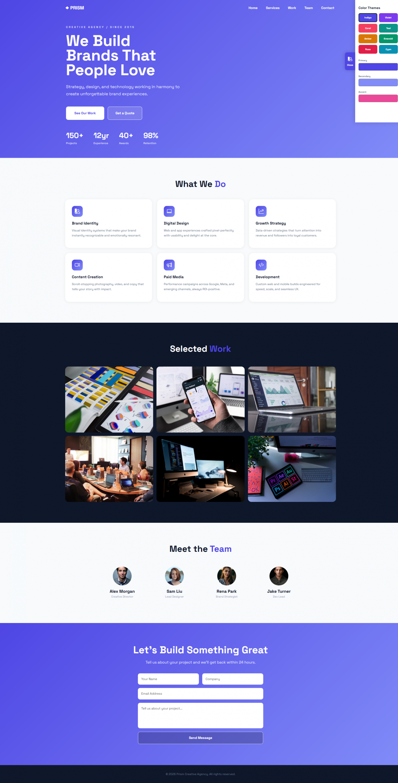
| 7 | Creative Agency |
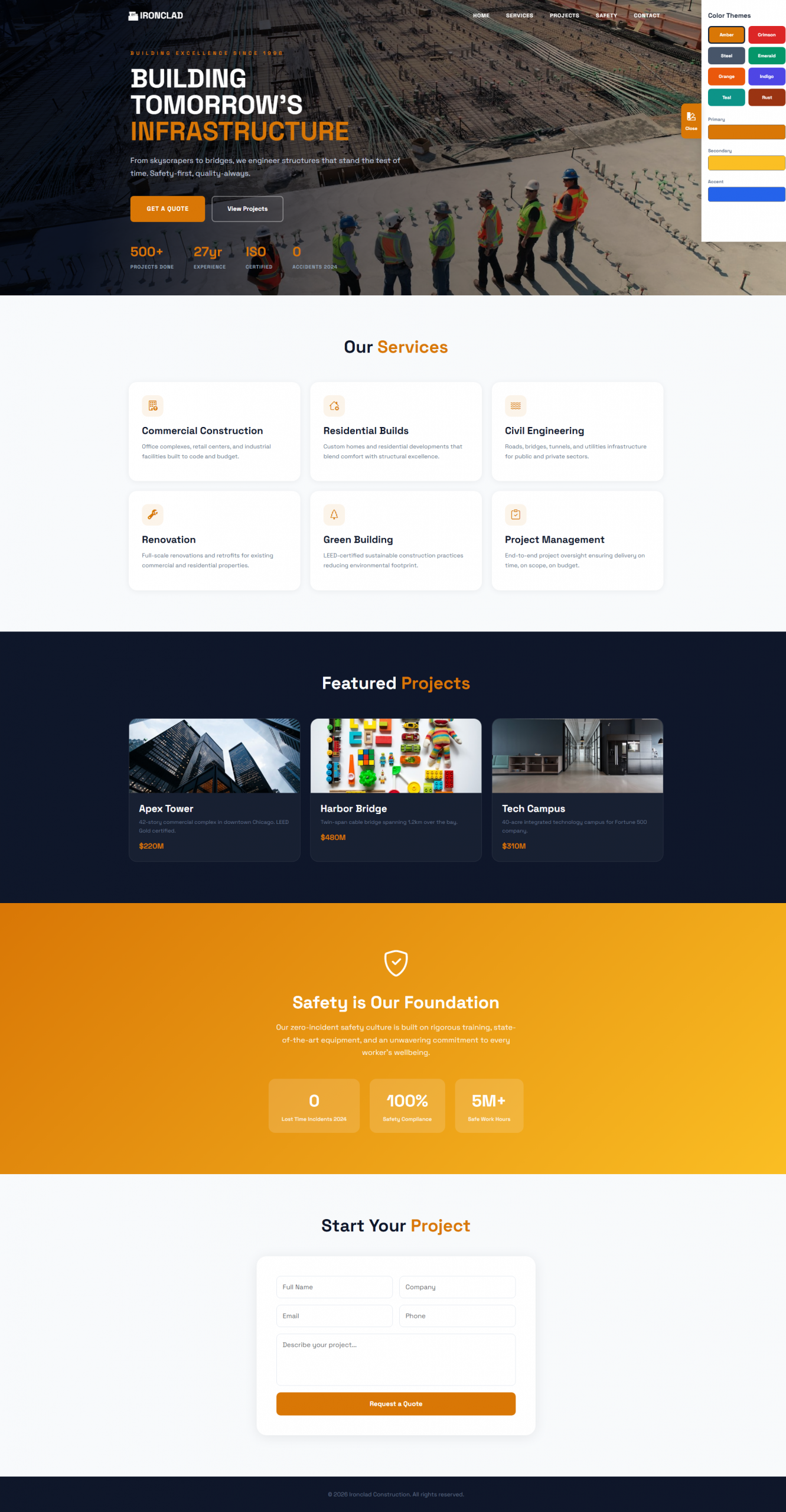
| 8 | Construction Firm |
| 9 | Architect Studio |
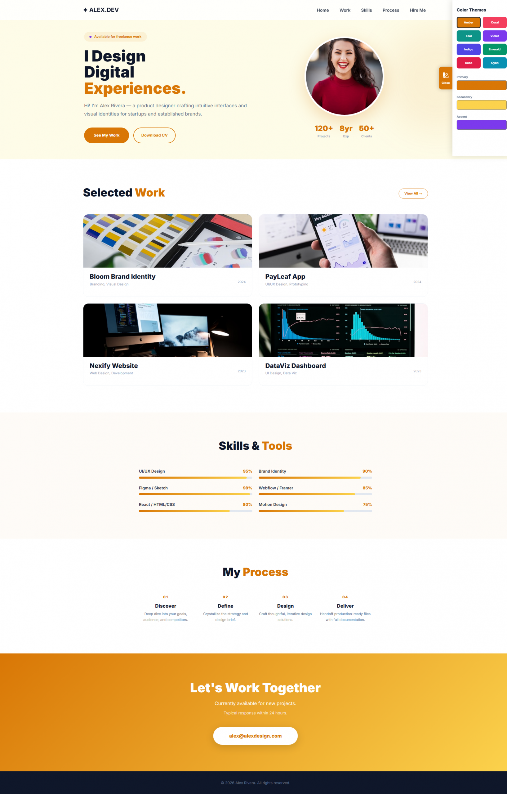
| 10 | Freelance Designer |
| 11 | Modern Ad Agency |
| 12 | Photo Studio |
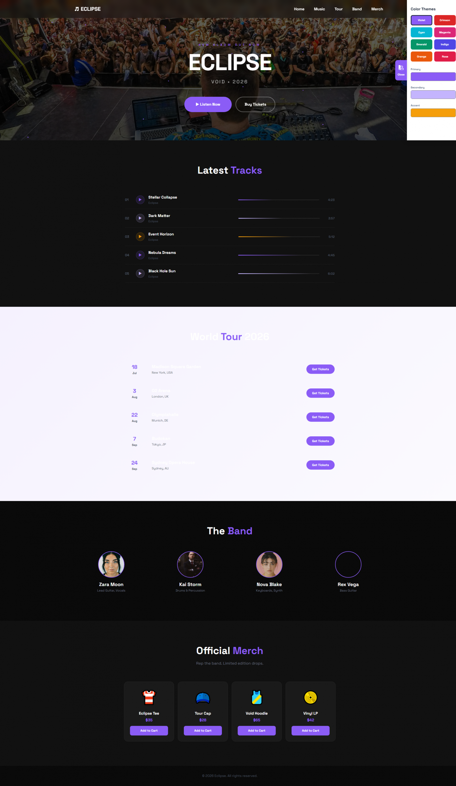
| 13 | Music Band |
| 14 | Real Estate |
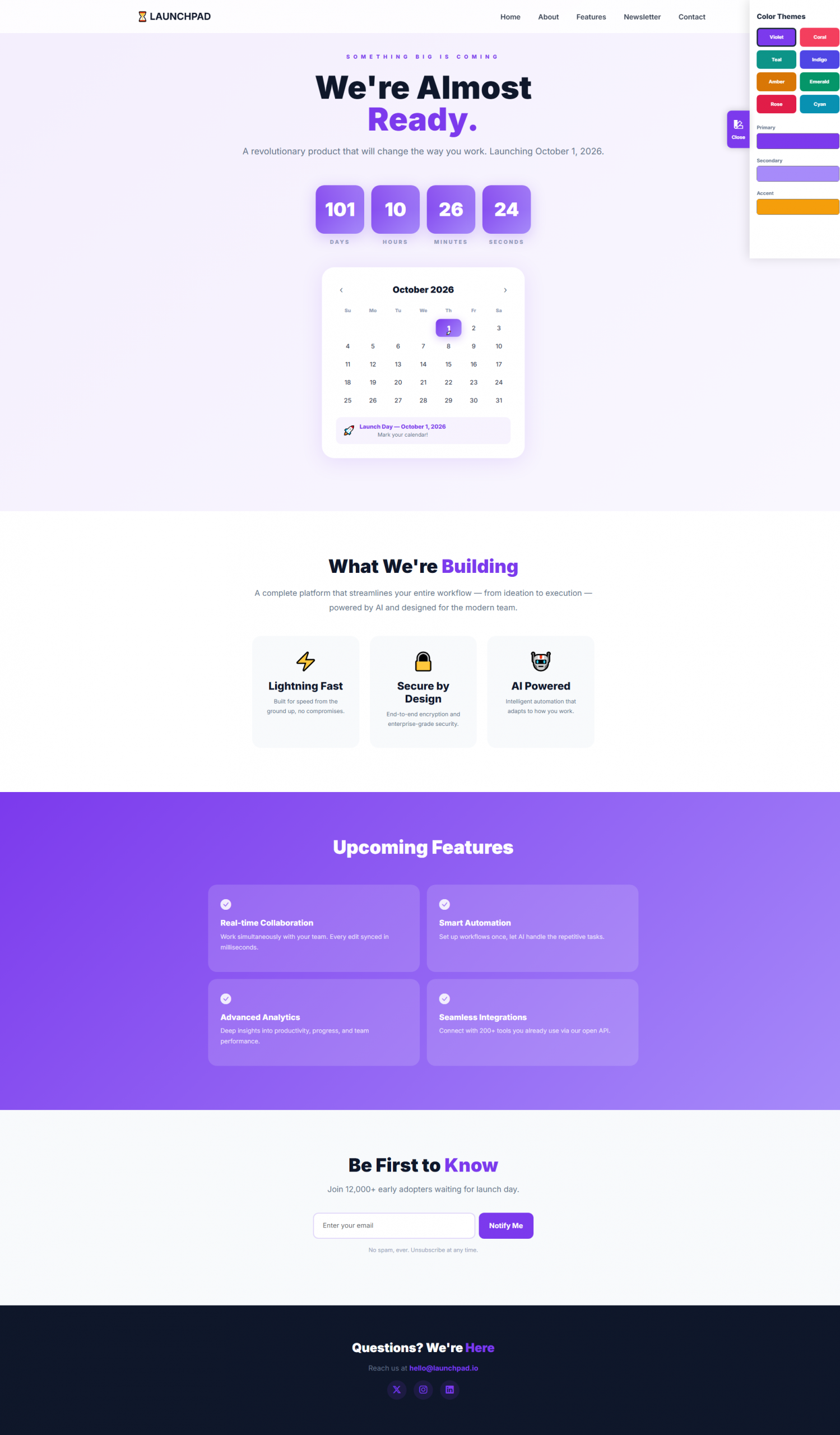
| 15 | Coming Soon |
Modern Creative 15 Themes Bundle